
Tesseract
Styles
Tesseract ExtraLight
Tesseract ExtraLight Italic
Tesseract Light
Tesseract Light Italic
Tesseract Regular
Tesseract Italic
Tesseract Bold
Tesseract Bold Italic
Tesseract Black
Tesseract Black Italic
Tesseract In Use
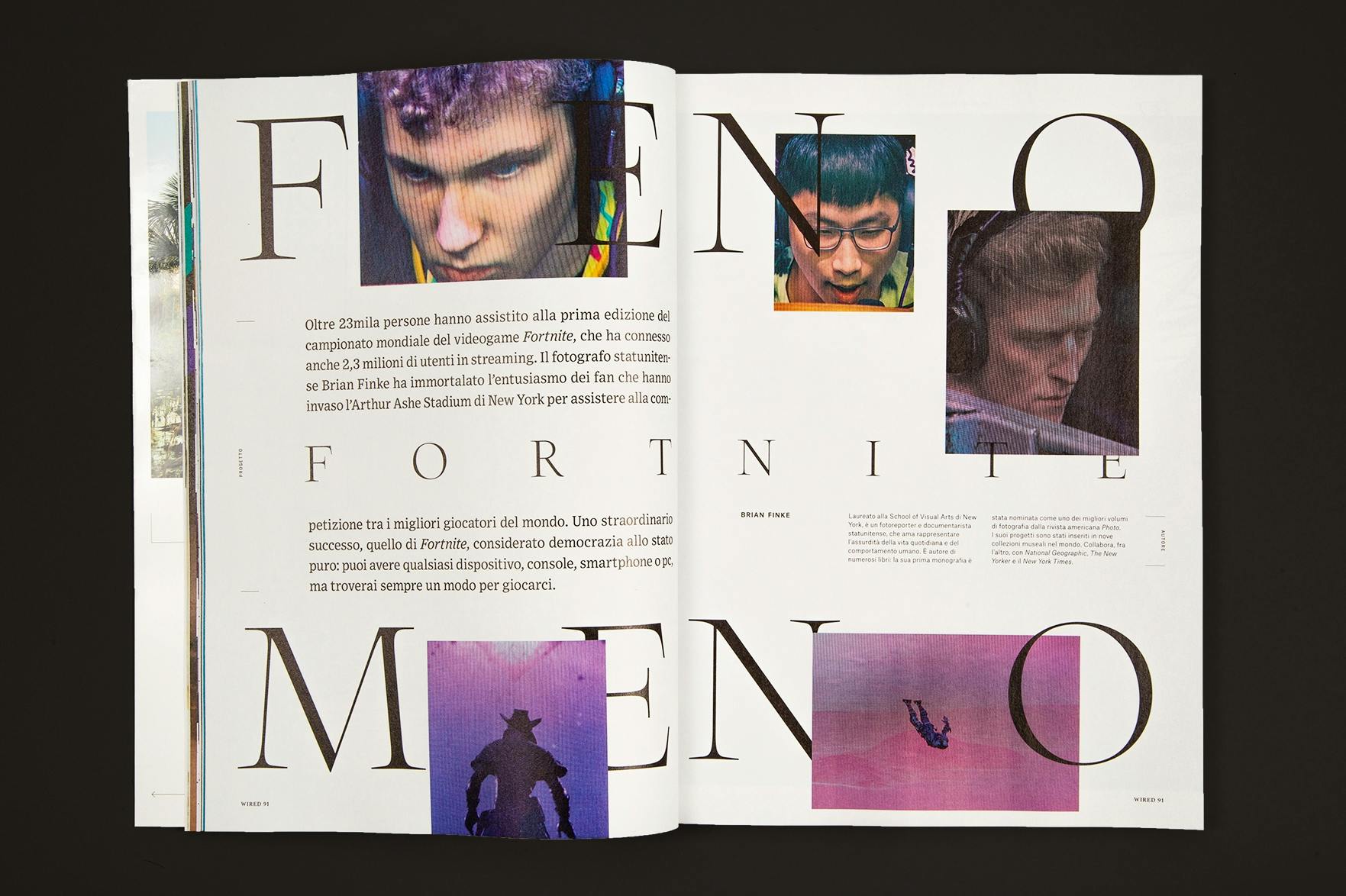
Tesseract in early use for the lastest issue of Wired Italia, a magazine about technology and lifestyle with art direction by Pitis e Associati. Issue n. 91 (winter 2019/2020) is titled “Visioni 2020”. Wired asked twelve photographers to show how the world is changing. The prologue to the features is by Jeremy Rifkin. Japanese artist Hiroto Hikeuchi contributed the cover image. Headlines are set in caps from Tesseract Display. Each of the features gets a different typographic treatment: Sliced words on sloping baselines for Preston Yarger’s “Post Acopalittico”, supersized caps interlaced with images for Brian Finke’s “Fenomeno Fortnite”, or letterforms of varying size hung on a line for Hiroto Hikeuchi’s “Cyber Funk”. The running heads at the bottom of the pages are set in Tesseract. The Text size of the typeface collection by Production Type is distinguished by a smaller x-height and a less pronounced stroke contrast. Pitis e Associati paired Tesseract with Exchange (Frere-Jones Type) as well as Atlas Grotesk and the monospaced Atlas Typewriter (Commercial Type) for text. The business supplement in tabloid format is dedicated to the changes in the world of energy. Headings, infographics, and drop caps in this section use ITC Motter Corpus.
Tesseract Display Black + Tesseract Black
Wired Italia, n. 91, “Visioni 2020”


Information
Design
Release Date
2019-10-22Team
Version
2.001About this font
As Tesseract plunged into classical references, it earned its contemporaneity through whetted endings and constrained curves, lending a focused aspect to texts and titles.
With optical sizes for text and a display, Tesseract shimmers across media. The Display size plays the wide aperture and x-height card, with chiseled terminals and see-through counterspace. The Text size is quieter, with a firm and sturdy structure for immersive reading. The matching italics dance a vibrant staccato and complete the family.
The crucible for Tesseract is made of many, and contains paradoxes. Where round turns give affability and amplitude to the design, abrupt endings and spiky details grant some grave austerity to an otherwise delicate design. For adventurous users, Tesseract contains multiple dimensions. Dive in.
Formats
Static (OTF, TTF, WOFF, WOFF2)About the designers

Jean-Baptiste Levée is a type designer with a strong focus on corporate and bespoke typefaces.
Jean-Baptiste Levée
CEO, founder
Jean-Baptiste Levée (1981) has designed over a hundred typefaces for industry, moving pictures, fashion and media. He is the founder of the independent foundry Production Type.

