Qommodore
Buying options
Edit text
Edit styles
Pangram…
Style names
Quick fox jumps nightly above wizard.
Lorem ipsum dolor sit amet, consectetur adipiscing elit, sed do eiusmod tempor incididunt ut labore et dolore magna aliqua.
ABCDEFGHIJKLMNOPQRSTUVWXYZ&
abcdefghijklmnopqrstuvwxyz&
0123456789
Apply to all

Qommodore - ExtraLight

Pangram…
Style names
Quick fox jumps nightly above wizard.
Lorem ipsum dolor sit amet, consectetur adipiscing elit, sed do eiusmod tempor incididunt ut labore et dolore magna aliqua.
ABCDEFGHIJKLMNOPQRSTUVWXYZ&
abcdefghijklmnopqrstuvwxyz&
0123456789
Apply to all
From €80

Qommodore - ExtraLight Italic

Pangram…
Style names
Quick fox jumps nightly above wizard.
Lorem ipsum dolor sit amet, consectetur adipiscing elit, sed do eiusmod tempor incididunt ut labore et dolore magna aliqua.
ABCDEFGHIJKLMNOPQRSTUVWXYZ&
abcdefghijklmnopqrstuvwxyz&
0123456789
Apply to all
From €80

Qommodore - Light

Pangram…
Style names
Quick fox jumps nightly above wizard.
Lorem ipsum dolor sit amet, consectetur adipiscing elit, sed do eiusmod tempor incididunt ut labore et dolore magna aliqua.
ABCDEFGHIJKLMNOPQRSTUVWXYZ&
abcdefghijklmnopqrstuvwxyz&
0123456789
Apply to all
From €80

Qommodore - Light Italic

Pangram…
Style names
Quick fox jumps nightly above wizard.
Lorem ipsum dolor sit amet, consectetur adipiscing elit, sed do eiusmod tempor incididunt ut labore et dolore magna aliqua.
ABCDEFGHIJKLMNOPQRSTUVWXYZ&
abcdefghijklmnopqrstuvwxyz&
0123456789
Apply to all
From €80

Qommodore - Regular

Pangram…
Style names
Quick fox jumps nightly above wizard.
Lorem ipsum dolor sit amet, consectetur adipiscing elit, sed do eiusmod tempor incididunt ut labore et dolore magna aliqua.
ABCDEFGHIJKLMNOPQRSTUVWXYZ&
abcdefghijklmnopqrstuvwxyz&
0123456789
Apply to all
From €80

Qommodore - Italic

Pangram…
Style names
Quick fox jumps nightly above wizard.
Lorem ipsum dolor sit amet, consectetur adipiscing elit, sed do eiusmod tempor incididunt ut labore et dolore magna aliqua.
ABCDEFGHIJKLMNOPQRSTUVWXYZ&
abcdefghijklmnopqrstuvwxyz&
0123456789
Apply to all
From €80

Qommodore - Medium

Pangram…
Style names
Quick fox jumps nightly above wizard.
Lorem ipsum dolor sit amet, consectetur adipiscing elit, sed do eiusmod tempor incididunt ut labore et dolore magna aliqua.
ABCDEFGHIJKLMNOPQRSTUVWXYZ&
abcdefghijklmnopqrstuvwxyz&
0123456789
Apply to all
From €80

Qommodore - Medium Italic

Pangram…
Style names
Quick fox jumps nightly above wizard.
Lorem ipsum dolor sit amet, consectetur adipiscing elit, sed do eiusmod tempor incididunt ut labore et dolore magna aliqua.
ABCDEFGHIJKLMNOPQRSTUVWXYZ&
abcdefghijklmnopqrstuvwxyz&
0123456789
Apply to all
From €80

Qommodore - Bold

Pangram…
Style names
Quick fox jumps nightly above wizard.
Lorem ipsum dolor sit amet, consectetur adipiscing elit, sed do eiusmod tempor incididunt ut labore et dolore magna aliqua.
ABCDEFGHIJKLMNOPQRSTUVWXYZ&
abcdefghijklmnopqrstuvwxyz&
0123456789
Apply to all
From €80

Qommodore - Bold Italic

Pangram…
Style names
Quick fox jumps nightly above wizard.
Lorem ipsum dolor sit amet, consectetur adipiscing elit, sed do eiusmod tempor incididunt ut labore et dolore magna aliqua.
ABCDEFGHIJKLMNOPQRSTUVWXYZ&
abcdefghijklmnopqrstuvwxyz&
0123456789
Apply to all
From €80

Qommodore - ExtraBold

Pangram…
Style names
Quick fox jumps nightly above wizard.
Lorem ipsum dolor sit amet, consectetur adipiscing elit, sed do eiusmod tempor incididunt ut labore et dolore magna aliqua.
ABCDEFGHIJKLMNOPQRSTUVWXYZ&
abcdefghijklmnopqrstuvwxyz&
0123456789
Apply to all
From €80

Qommodore - ExtraBold Italic

Pangram…
Style names
Quick fox jumps nightly above wizard.
Lorem ipsum dolor sit amet, consectetur adipiscing elit, sed do eiusmod tempor incididunt ut labore et dolore magna aliqua.
ABCDEFGHIJKLMNOPQRSTUVWXYZ&
abcdefghijklmnopqrstuvwxyz&
0123456789
Apply to all
From €80
Design:
Hugues Gentile.

Cyrillic:
Hugues Gentile.
Consulting by Ilya Ruderman and Yury Ostromentsky.

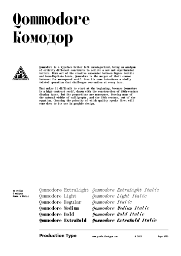
Qommodore is a typeface better left uncategorized, being an amalgam of entirely different constructs to achieve a new and experimental texture. Born out of the creative encounter between Hugues Gentile and Jean-Baptiste Levée, Qommodore is the merger of their common interest for monospaced serif. Even its name introduces a wholly twisted operation that challenges convention at every turn.

That makes it difficult to start at the beginning, because Qommodore is a high-contrast serif, drawn with the construction of 19th-century display types. But its proportions are monospace, forcing many of the natural widths of calligraphy, and the 19th century, out of the equation. Choosing the priority of which quality speaks first will come down to its use in graphic design.

There is a pervasive appreciation for high-contrast serifs, and Qommodore’s delicate and detailed hairline strokes are no exception. Like most typefaces in this genre, Qommodore gains weight only in its thick strokes, and the hairlines stay hairlines throughout. Despite the ubiquity of the high-contrast category, however, Qommodore restricts any dated notions. Breaking with convention, for example, the typeface comprises six weights, beginning with a skeleton frame in ExtraLight that will feel wider than its bolder weights simply because the thicker strokes aren’t prevalent. In ExtraBold, Qommodore is practically egregious in its contrast; because the font is monospace, the thick strokes borrow from the interior space, creating a dramatic and glitchy texture.

All-capitals titles will set beautifully as small as 60pt in ExtraLight and set a more traditional tone, with a narrow letter-fit and modern classic details. As you increase the weight, increase the scale, and drop the character count – it’s the best way to maintain comfort in reading while enjoying all of the quirky details to make designs feel unique and beautiful, unless you’re going for something with intentional tension.

That’s precisely the opportunity this typeface invites designers to enjoy – an unpredictable mashup of details like the intricate serifs on lowercase t and the graceful ß, with spatial discordance increasing with weight. Despite this experiment in spacing, one thing Qommodore avoids is any clashing of characters, instead just threatening legibility. These moments where one would expect discomfort get literally shaved off, such as in the ExtraBold Italic, where the rounds of characters abruptly stay in their allotted space. In these most dramatic moments of Qommodore, designers can amplify short words and even single characters for applications in media covers like albums, podcasts, and books. Check out its eponymous Q, stifling bold W and Extra Bold m, and corseted R; conversely, the shapely lowercase a and even the delightful punctuation.

Awards & distinctions

Hiii Typography Finalist 优异奖 2023

Character set

PDF Specimen

Download specimen

Qommodore in use

Download free trial

Cancel
Go to productiontype.com now